生活空間に調和するペットボトルデザイン
~キリンのやわらか天然水~
Design that blends into the living
KIRIN YAWARAKA WATER
著者
論文を見る→J-STAGE(購読者認証が必要です)
抄録
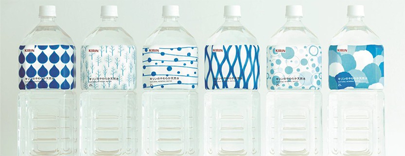
製品パッケージは製品の性能やイメージを体現する顔である。しかし、店頭での競争激化により、製品棚でのインパクトや同類他製品との差別化を図るための、広告としての主張の強さが、求められるようになったことは否定できない。
その一方で、実際に製品が使用されるリビングなどの生活空間において、その広告としての主張の強さが原因で調和せず、景観を損ねる結果になっていることも事実である。
そこで、キリンビバレッジ株式会社と株式会社電通は、日常的に使われる2リットルペットボトル天然水において、生活空間に調和し、インテリアとしても機能するデザインをコンセプトに、製品開発を行った。
また、販売チャネルをウェブに限定することでより表現の幅を広げることが可能になり、製品としての強みを、デザインそのものに持たせることに成功した。新しいコンセプトで作られた製品は、多くのメディアとSNSで話題になった。
Whether you like it or not, bottled mineral water becomes a part of the interior. But bottle designs in Japan lack this point of view. Their designs are noisy and unsophisticated.
This cannot be helped, because bottles have the role as advertisement. They have to stand out in the store for the shoppers to choose them.
We created a mineral water with no advertisement on the bottle, so that the bottle harmonizes with the interior.
We limited the sales channel to Amazon, so that the bottle did not need to have the role as advertisement like other mineral water in the store.
By appealing the bottle’s design, we gained new customers. The design made mineral water a cool item to display in the room, and this product was taken up and shared by many media and SNS. A product with no advertisement, in fact was what consumers desired.

